
When working with SwiftUI’s TextField starting from iOS 16, Apple introduced the axis to the initializer. 🎉
swiftinit(
    _ titleKey: LocalizedStringKey,
    text: Binding<String>,
    axis: Axis
)
By setting it to .vertical, you can make the text field expand as the user types more content — provided you also set lineLimit(nil) and there’s available space in the layout.
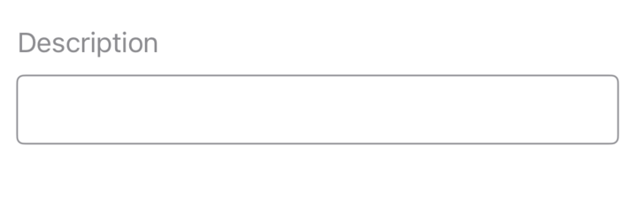
Take this simple example
swiftstruct BorderedTextField: View {
    @State private var text: String = ""

    var body: some View {
        LabeledContent {
            TextField("", text: $text, axis: .vertical)
                .lineLimit(nil)
                .padding(10)
                .overlay(
                    RoundedRectangle(cornerRadius: 4)
                        .stroke(.gray, lineWidth: 1)
                )
        } label: {
            Text("Description")
                .foregroundStyle(.secondary)
        }
        .labeledContentStyle(TopLabeledStyleConfig())
    }
}
Here we have a custom BorderedTextField that can be reused across the app.
We set the axis to .vertical, lineLimit to nil, add a border, and that is pretty much it.
The code above will produce the following result:
Obviously, you may have noticed that I used LabeledContent so we can add a label to our text field.
By default, the LabeledContent places the label horizontally next to the text field.
That’s why I added a custom .labeledContentStyle that changes this behavior, aligning the label vertically instead.
All you have to do is add this to the code base:
swiftstruct TopLabeledStyleConfig: LabeledContentStyle {
    func makeBody(configuration: Configuration) -> some View {
        VStack(alignment: .leading) {
            configuration.label
            configuration.content
        }
    }
}
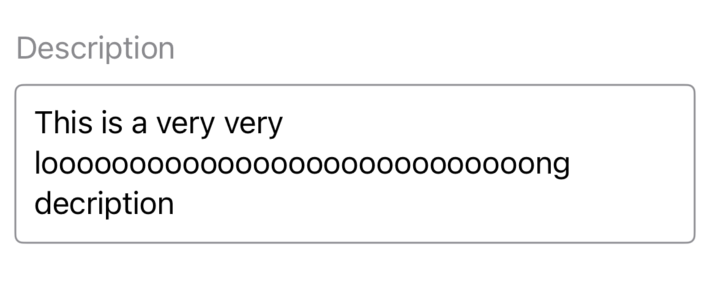
Now that we have our UI in place, let’s make the default height of the text field bigger than a single row when it’s empty.
For example, we might want the height to match what it would be with 3 or 4 lines of text, even when no text is actually present.
You might even be tempted to solve this problem by just changing this:
swift.lineLimit(nil)
to this:
swift.lineLimit(4, reservesSpace: true)
And you wouldn’t be mistaken!
The default height of the text field does increase when it’s empty.
However, once the text exceeds 4 lines, it will stop expanding and start scrolling inside, just like a TextEditor would.
And this scenario has its place and can be very useful in many cases where that behavior is desired.
but...
The purpose of this article is to show how to set a minimum height while still allowing the text field to expand infinitely if vertical space allows.
Usually, you would place this in a ScrollView, so the text field can grow without limits.
An alternative
We can take advantage of the .frame modifier to add a minimum height to the text field.
This will instantly make the text field bigger while still allowing it to expand as the user types, beyond that minimum height.
swiftTextField("", text: $text, axis: .vertical) .lineLimit(nil) .frame(minHeight: 120, alignment: .top) //<-- .padding(10) .overlay( RoundedRectangle(cornerRadius: 4) .stroke(.gray, lineWidth: 1) )
Everything is nice and good...
but let’s add a .background(.green) for debugging this approach, placed exactly after .lineLimit(nil).
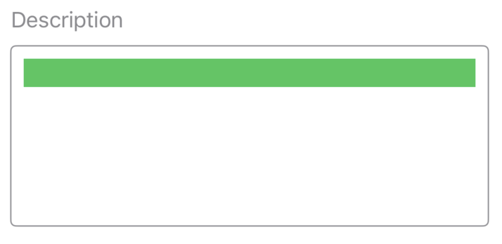
Hmm, that’s probably not ideal.
The reason I say this is that if the green background is gone, users will naturally expect that tapping anywhere inside the bordered text field area should still bring up the keyboard and allow typing.
Sadly, this isn’t the case for our current implementation. 😞
Luckily, since iOS 15 , we can take advantage of the @FocusState property wrapper.
and...
With a little clever combination of that wrapper and a background modifier, we can trigger the keyboard or typing mode whenever the user taps anywhere inside the bordered text field.
The final code now looks something like this:
swiftstruct BorderedTextField: View {
    @State private var text: String = ""
    @FocusState private var isFocused: Bool // 1

    var body: some View {
        LabeledContent {
            TextField("", text: $text, axis: .vertical)
                .lineLimit(nil)
                .frame(minHeight: 120, alignment: .top)
                .padding(10)
                .background(.white) // 2
                .focused($isFocused) // 3
                .onTapGesture() { // 4
                    isFocused = true
                }
                .overlay(
                    RoundedRectangle(cornerRadius: 4)
                        .stroke(.gray, lineWidth: 1)
                )
        } label: {
            Text("Description")
                .foregroundStyle(.secondary)
        }
        .labeledContentStyle(TopLabeledStyleConfig())
    }
}
- We added a boolean
@FocusStateproperty that controls when the text field is focused. - Added a background that the user can tap to trigger the focus state. In a production app, I recommend passing the background color, instead of hardcoding it. It’s also better to use asset colors that adapt to light and dark mode.
- Attached that focus state to our text field.
- Added a simple tap gesture that triggers the focus state.